web design

avery presbyterian church

Mobile, Desktop, iPad Web Design Mockup

challenge

A well-designed website serves as the digital “front porch” for businesses and organizations, especially for churches. Many people who are searching for a church  will start with a search online for churches in their community. Often the churches that people elect to check out are ones that have efficient websites that are both informative and engaging. Avery Presbyterian Church had a website, but it was in need of a digital facelift. Their old site was dated, clunky, poorly formatted for mobile and very inefficient to new and returning users alike. It was confusing to navigate and was littered with redundant information. In short, Avery Presbyterian Church’s front porch was decaying, and it needed to be rethought.
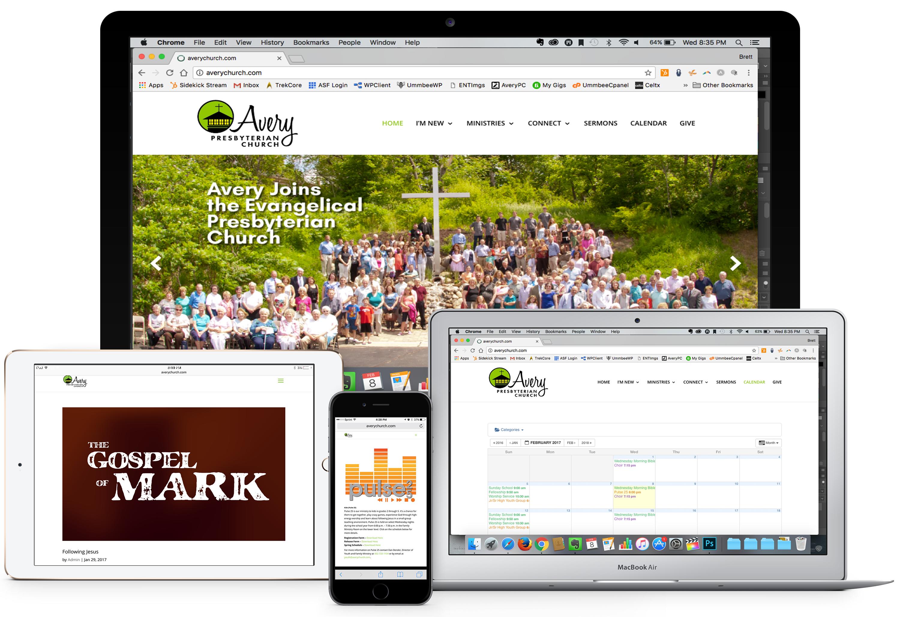
Web Design Screen Shot

objective

“Give us a Welcoming Front Porch”

A front porch should be well-maintained with room for people to gather safely. It should be a place where people can get to know you just a little bit – find out what you are about and get a feel for who you are. Avery’s front porch didn’t need a renovation, it needed to be rebuilt from the ground up.

We were invited to propose a solution for the church that would be cost-effective, and would give them a website that was simple, easily navigable, attractive, informative and easy to maintain. We were asked to build a website that would be able to grow with the church, and would serve as that new front porch that welcomes in new visitors and returning members.

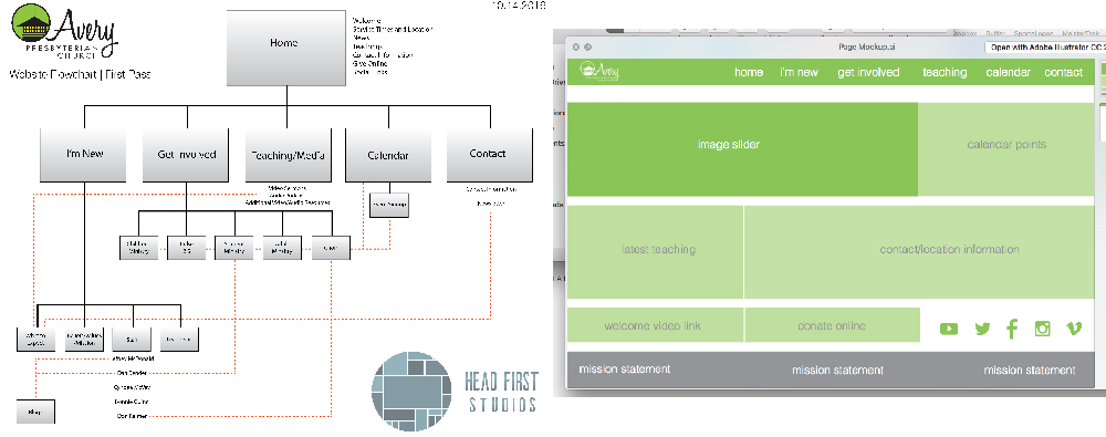
Web Design Screen Shot Wireframe

concept & planning

Throughout the project we worked with three different “point people” who had differing ideas of what would make the site effective in the church’s community. We began the process attempting to build a site that was friendly on browsers but was truly built for a mobile experience. Icons rather than lengthy prose were the order of design, giving the user a very visual experience that was simple to the point that one would be able to navigate and learn about the church even with a limited reading level. We kept everything on the site categorized into 5 main subjects, and began work on an interactive calendar and event system as well as an online giving portal.

Web Design Screen Shot

design & development

By the time the website was ready to preview we had moved on from the early concepts of an icon-driven mobile-first site. In fact, the site itself had been scaled down to retain only the most essential elements for a church website to be relevant in the online community. This had been done with the caveat that some of the elements that had been taken out such as an online giving portal, social media integration and sermon video content would be added back into the site at a later date.

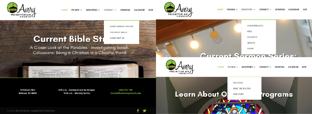
The final website features many traditional design elements that you will find in many church websites. The main slider on the front page cycles with images taken around the church building, and link the user to different pages within the site. We maintained an anchored navigation menu at the top of the screen at all times as well as a uniform footer allowing visitors to find contact information for the church anywhere on the site. Each major ministry has its own page with a brief writeup as well as select pictures from events and activities they offer. We rounded out the content with an interactive calendar visitors can subscribe to, options to access the church newsletter in pdf format, listen to recent sermons and even hear a handful of the songs the church choir has performed.

Web Design Screen Shot

ux / navigation

We opted for a very traditional UX/navigation setup so even the most infrequent user can make use of the site. There is a top-level navigation menu that features drop-down menus and is always visible no matter where the user is on the site. While the main page is image-centric and light on text, all of the secondary page are laid out in a uniform manner that draws attention to the copy. The footer throughout the site lists service times and essential contact information for the church as well as links to the church’s social media accounts.

Web Design Screen Shot

mobile site

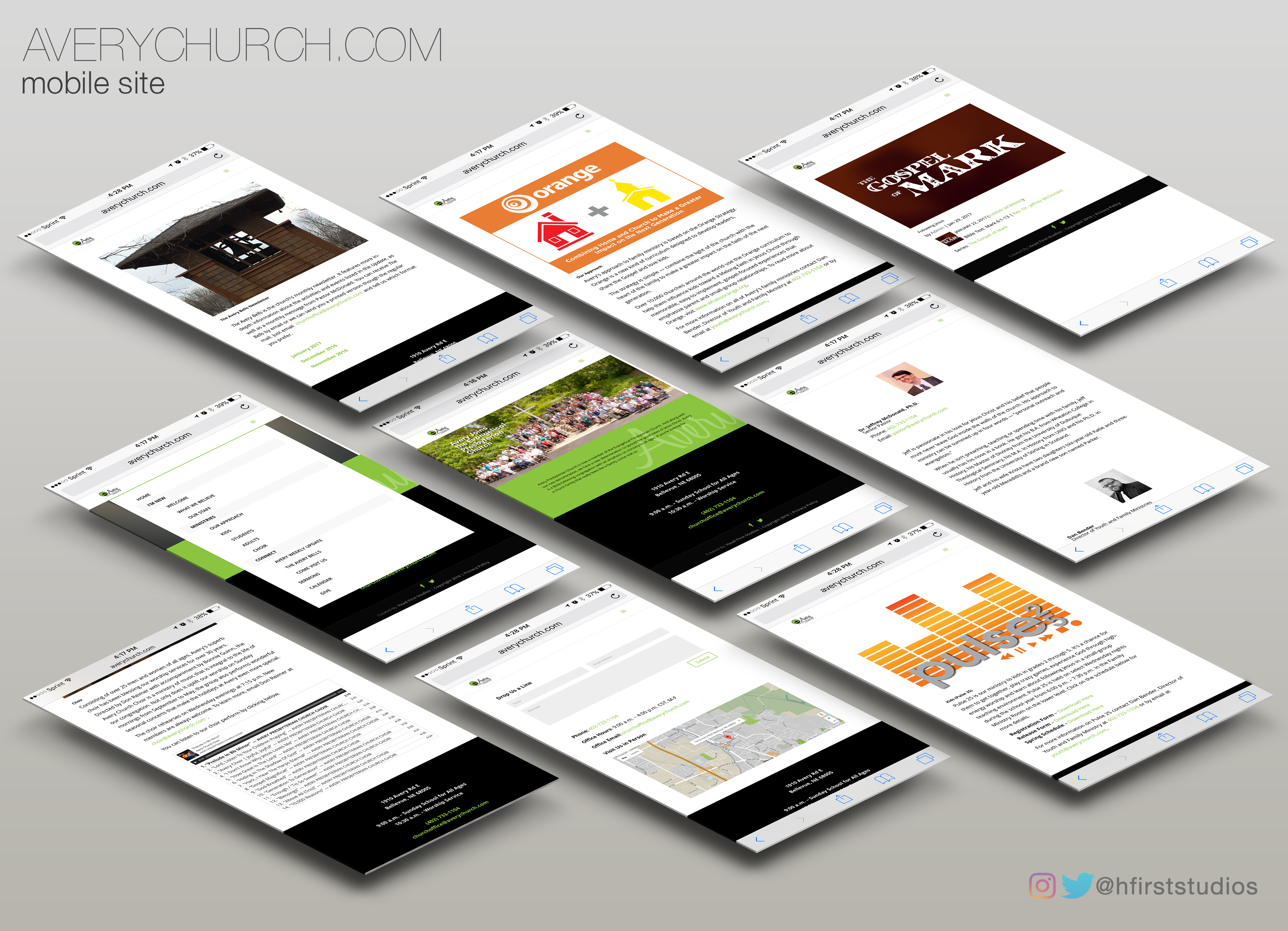
Though the direction of the website shifted from a mobile-based site to a desktop-driven site, we did create a mobile-responsive version that is available to users. The mobile site contains all of the information and media that the desktop site hosts, but is formatted to fit nicely on a phone or tablet screen. Since the data says most people are going to be looking for a new church on their phone, this made sense to us.

Mobile Web Design Mockup